This chapter explains KMP's Graphical User Interface (GUI). The GUI lets you control every aspect of KMP.
There are two user interfaces in KMP:
Back-end (we also call it "Control Panel" or "Admin Area"). It is for Staff users. It allows doing every single thing: create, edit, and view content, manage user accounts, work with customer feedback, customize look of the front-end part, and administrate the knowledge base. Back-end always requires login.
Front-end is designed as a public website and is intended for use by anonymous and Client users, for example your customers or other website visitors. You can restrict access to the front-end, and require login, for example if you want to allow access for registered clients and your staff only (i.e. deny any public access to the knowledge base). Staff users can create, edit, and delete content from the front-end as well as from the back-end.
We will discuss the details of back-end user interface right now, and later return to the front-end.
The GUI is divided up into four parts.
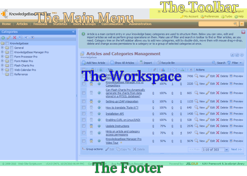
The Toolbar
The toolbar displays on every screen.

Use the toolbar to perform tasks related to your account preferences and your profile details.
|
View your KB |
Opens the public area - front-end interface of the knowledge base. |
|
Logout |
Logs you off from KMP |
|
My Account |
Allows change your user profile options: name, password, email,language and time settings, etc. |
|
Preferences |
Contains your personal preferences related to GUI behavior andappearance. |
|
Turbo |
Enables local storage of certain application files (images,JavaScript and CSS) avoiding the need to redownload them from the web onevery application reload. In order to use it you'll need to have GoogleGears installed on your PC. |
|
Help |
Opens general help for KMP that also includes the link to thisknowledge base. |
The Main Menu
The main menu displays on every screen.

Use the main menu to go to screens where you can create, configure and manage your knowledge base.
|
Home |
Shows bits of the knowledge base articles, feedback entries, newitems creation buttons, etc. on a single screen. |
|
Articles |
Includes main tools for authoring: creation of articles, categories,article templates, glossary, management of article drafts and emailsubscriptions. |
|
Feedback |
Tools for user feedback are here. You can approve, decline, andanswer comments here, work with user questions, check rating trends and reactto negative feedback here. Also list of censored words for user comments canbe edited here. |
|
Statistics |
Contains statistical information for articles and categories usage,search reports, and author activity charts. |
|
Users & Groups |
User management tools live here. You can create a new user or a group,approve registered user and assign him to a group here. |
|
Customization |
Tools for customization of front-end look and feel, custom article fields,user profile fields, and custom ratings. |
|
Administration |
Administrative tools that mostly related to preferences for the wholeknowledge base. |
The following notation will be used in this manual and other articles in the knowledge base:
Go to Articles > Articles & Categories
This means that you need to click on the Articles in the main menu and then click on the Articles & Categories item:
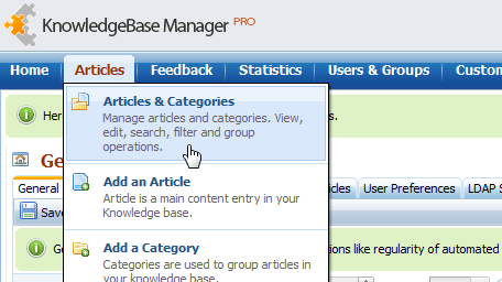
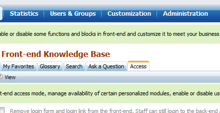
Also additional step can be mentioned in this notation, which points to a tab on the destination page:
Go to Customization > Styling and Front-end Settings > Access
This means "Click on the Customization in the main menu, then click on the Styling and Front-end Settings..."
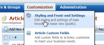
"...then click on the Access tab on the new screen".
The Workspace
The contents that display in the workspace depend on the screen you are currently viewing. Usually you can go to another screen by clicking on a main menu item. Also dialog windows open over the workspace.
The Footer
Footer shows information about:
- your version of KMP
- link to Support Center
- link to Bug Report/Feature Request form
Tooltips
Many objects in the GUI have context help icons next to them (?). Place your mouse pointer over the tooltip

or (if you mouse pointer changes to "hand") click on it to see more relevant information.

Other objects have text links next to them. Click these links to see an article from our knowledge base on the subject.

Data Grids
Data grids are used to present lists of entries with ability to create, view, and manage them.

Entries
Each entry represents an entity like article, glossary, term, comment, etc. depending on what screen you're on. Often entry has a checkbox that you can check to apply a group action on selected entries then. It shows the entity properties in one or several columns, e.g.: title, creation date, id, etc. Also it has several action buttons that you can click to view, edit, delete, etc. the entity.

Sorting Columns
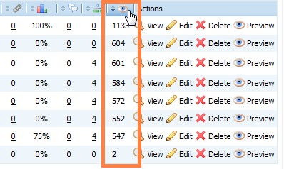
You can sort entries by almost any column. To do that, click the column header. First click sorts them in ascending order, second click sorts in descending order.
Group Actions
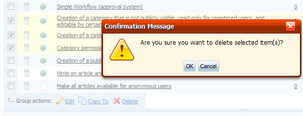
You can select several entries by clicking their checkboxes and do a group action on them. Most common group action is "delete", in some cases you can edit or copy several entries at once.
Toolbar with Buttons
Toolbars usually contain several buttons for creation of relevant entries – articles, comments, users, etc.

Instant Search
Instant search allows searching "here and now" within the items shown in current grid. For example you may select a category on the left panel (on Articles > Articles & Categories screen) and articles assigned to this category will be shown in the grid. You can use instant search now to search through these articles. It searches through the articles content as well as through the titles.
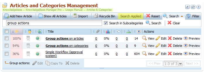
Path to the current category is marked with green color on the screenshot. We are searching in this category. Note that the "Search in Subcategories" checkbox is checked.
"Search Applied" marked with yellow color shows that we're watching a search results in the grid, instead of the all entries of the current category.
Magenta area shows relevance - measure of how entry is pertinent to the search phrase.
Filter
Filters can be used to select items from current grid that match certain conditions. For example you can filter out featured articles that have from 1 to 5 attachments.
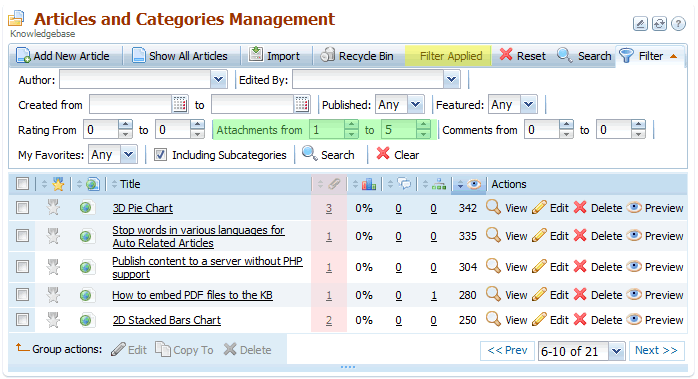
Filtering parameter is marked in green on the screenshot.
"Filter Applied" marked with yellow color shows that we're watching a search results in the grid, instead of the all entries of the current category.
Magenta area shows column with number of attachments per article.
You can combine search and filters - you can filter out search results, or search in filtered items.
Navigating
Not all entries may be displayed on one grid page. You can go between pages with help of navigating tool.

|
<< Prev |
Click this to move backward one page in the list. |
|
Next >> |
Click this to move forward one page in the list. |
|
6-10 of 21 |
Select a range of entries to go to the respective page in the list. |
You can change the number of entries shown on a page. To do this - just drag the bottom grid border.

Grid Preferences
Click the first of the three buttons under the grid to open grid preferences window.
Grid preferences window allows you to change the set of shown columns, appearance of action and group action buttons, number of entries per page, and some other settings (settings can be different for each grid).
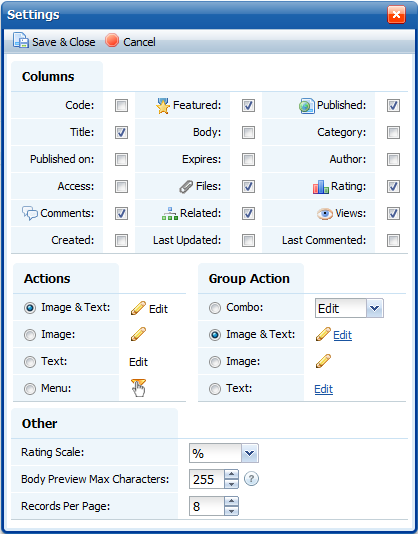
Note: You can reset the look of action and group action buttons in all grids at once. This can be done in the Preferences menu.
Reload Grid
KMP makes an Ajax request in the back-end when you click a button, select a menu item, etc. Ajax allows reloading a part of the web page, instead of reloading the whole page and losing time on loading the same unchanged data again and again such as footer, header, and other parts of layout. For example when you click on a main menu item and go to a different screen, only workspace (middle part) is reloaded – the main menu and the toolbar are not.
Reload grid button works in a similar way – you can click this button to reload grid entries without refreshing of the web page.
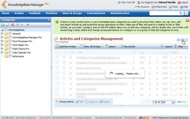
Use this button where you see it to refresh current container (e.g. grid) contents. Refrain from using the Refresh button on your browser toolbar (or F5/Ctrl-F5 shortcuts) unless you've got an error or just updated KMP to a new version. In these cases Ctrl-F5 would help to avoid future errors and get the latest versions of scripts and styles.
Required Fields
When you configure one of KMP's features, you may be required to enter information, or select an option. These mandatory fields are necessary to set up the feature. If you try to save your changes without configuring a required field, a warning displays.
Fields marked with a red asterisk (*) are mandatory, whereas others are optional.

Confirmation Notices
When you have performed an action that modifies KMP's configuration, a notice displays when the screen reloads, confirming that your modification was completed successfully.

Or not successfully

If it has been unsuccessful, press Ctrl-F5 to reload KMP and try again. If you'll get the error again, please follow this guide to enable error logs and report the problem to our support team.
The Home Screen
The home screen or the dashboard is shown when you log in the very first time or click the Home item in the main menu.
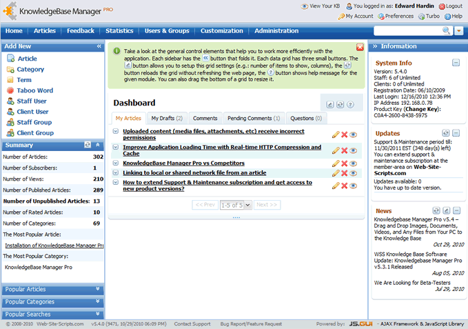
|
Add New |
Shortcuts for creation of an article, category, user, etc. |
|
Summary & Popular Articles, Popular Categories, Popular Searches |
General statistics for articles, categories, and searches. |
|
Dashboard (Recently added entries) |
Your articles (sorted by last change date), article drafts, user questions, comments pending moderation, approved comments. Some of the listed tabs may not be shown if related option is disabled in general options. |
|
System Info |
Info about KMP version, license, etc. |
|
Updates |
Shown remainder of Support & Maintenance subscription and availability of updates. |
|
News |
Shows new posts from Web-Site-Scripts blog. Often includes information about new releases, announces, best practices, etc. |
Next chapter: Articles Overview >>
